Dairy Queen Rebrand
Dairy Queen Rebrand

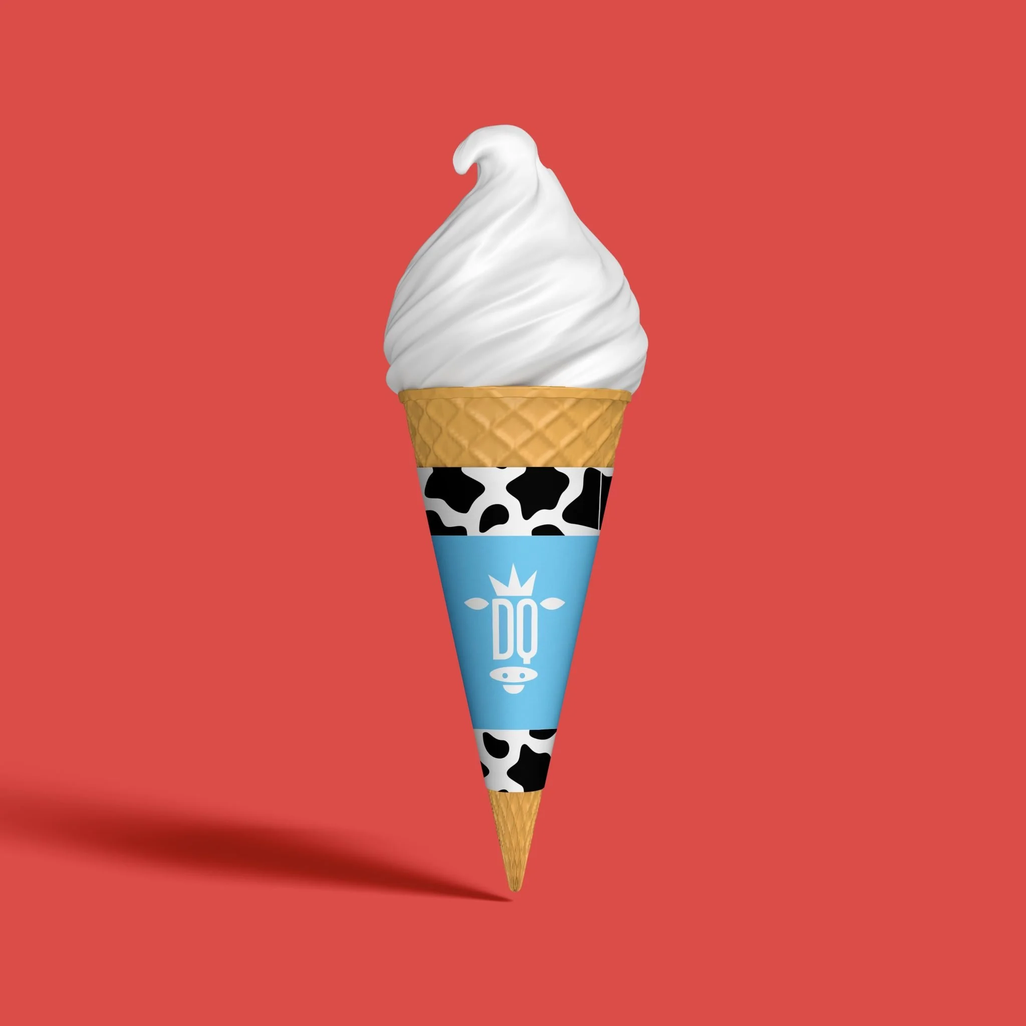
For this project, I was told to take an existing brand, company, or service and rebrand it. I needed to identify key weaknesses in the brand and develop a strategy to propel the brand forward for it to thrive in it’s market. Dairy Queen is a family oriented fast food restaurant with a long history of small town, midwestern roots. Unfortunately, it lacks consistent brand identity and struggles to bring in new customers. This rebrand was aimed to reinstate an emotional connection to the brand by capitalizing on nostalgia and define a clear, universal brand identity so that Dairy Queen can effectively compete in the fast food market while still maintaining and appealing to their current family audience. And, who doesn’t love cows? In this rebrand, I decided to keep the Dairy Queen logo condensed to only “DQ.” It’s short, effective, and easy to read. I decided to make the word mark into a cow graphic because the founder viewed cows as being quite literally the “queens of dairy.” This also helps the family and nostalgic background of the company. I decided to keep the signature Dairy Queen red as it is recognizable and we don’t want to lose our customers we have already. I got rid of the orange color in the original logo, as it is not needed, and decided to make the blue more light and vibrant to use as an accent color in packaging. I also decided to keep the tagline, “Happy tastes good!” because I find it short and effective for an audience of all ages.
-
![]()
Logo
-
![]()
Ice Cream Mockup
-
![]()
Package Design